ASTONISH,

A responsive, fantasy-based website experience for a collaborative writing community.
ASTONISH

ROLE: Lead Designer

DURATION: May 2023 - Nov. 2023 (6 Months)

ASTONISH's website design focuses on two main aspects:

  1. Creating a seamless user journey across all devices
  2. Allow users to easily read and write content easily

Starting synthesis

User Interviews

For this project, I conducted four interviews with members of the target audience: online creative writers ranging from mid-20s to early 30s. I was both moderator and note-taker for the entirety of these interviews.

COMMON OBSERVATIONS

  • All interviewees discussed often being busy with life and occupational activities, and mobile activity.
  • Many interviewees expressed a want for more mobile-friendly designs.
  • There was a large divide between preferences for light and dark themes.
  • Majority expressed a need for larger font sizes due to eye strain and vision issues.

With these observations in mind, I moved to create a problem statement to encapsulate what I believed to be the standout opinions expressed in there interviews.

Problem Statement: Creative writers need an easy way to post and participate in conversations online seamlessly across devices, even though work and other life events may take them away from usual setups.

Brainstorming

Competitive Audit

Through a mix of client reccomendations and my own research, I selected six active communities on the Jcink platform to conduct a competitive audit of.

Website Readability Desktop-focused Responsive Mobile Friendly Theme Toggle
Pixel Perfect Average Yes No No No
Etheria High Yes Yes Yes Yes
Hoenn Average Yes No No No
Faction Life Average No Yes Yes No
A Simple Life Average No Yes Yes No
Axis Mundi Average Yes No No Yes

KEY OBSERVATIONS

  1. Jcink-based forums were often desktop-focused and were unresponsive or not mobile friendly.
  2. Readability was often hampered by small fonts sizes, and lack of contrast despite majority of the forums being ones where the userbase was expected to often read and write.

These observations were interesting, given the amount of feedback I heard from interviewees about how they liked websites that were able to give them a responsive experience.

It seemed like responsive websites were an untapped niche in the Jcink community, and with this in mind, I began ideating possible designs for a responsive layout for ASTONISH.

Initial Sketches

With some initial thoughts, I began the sketching process to bring to life some ideas to pitch to the client. I started with a series of nine, quick thumbnails of the header to get a general idea of the layout and style I would aim to carry throughout the design.
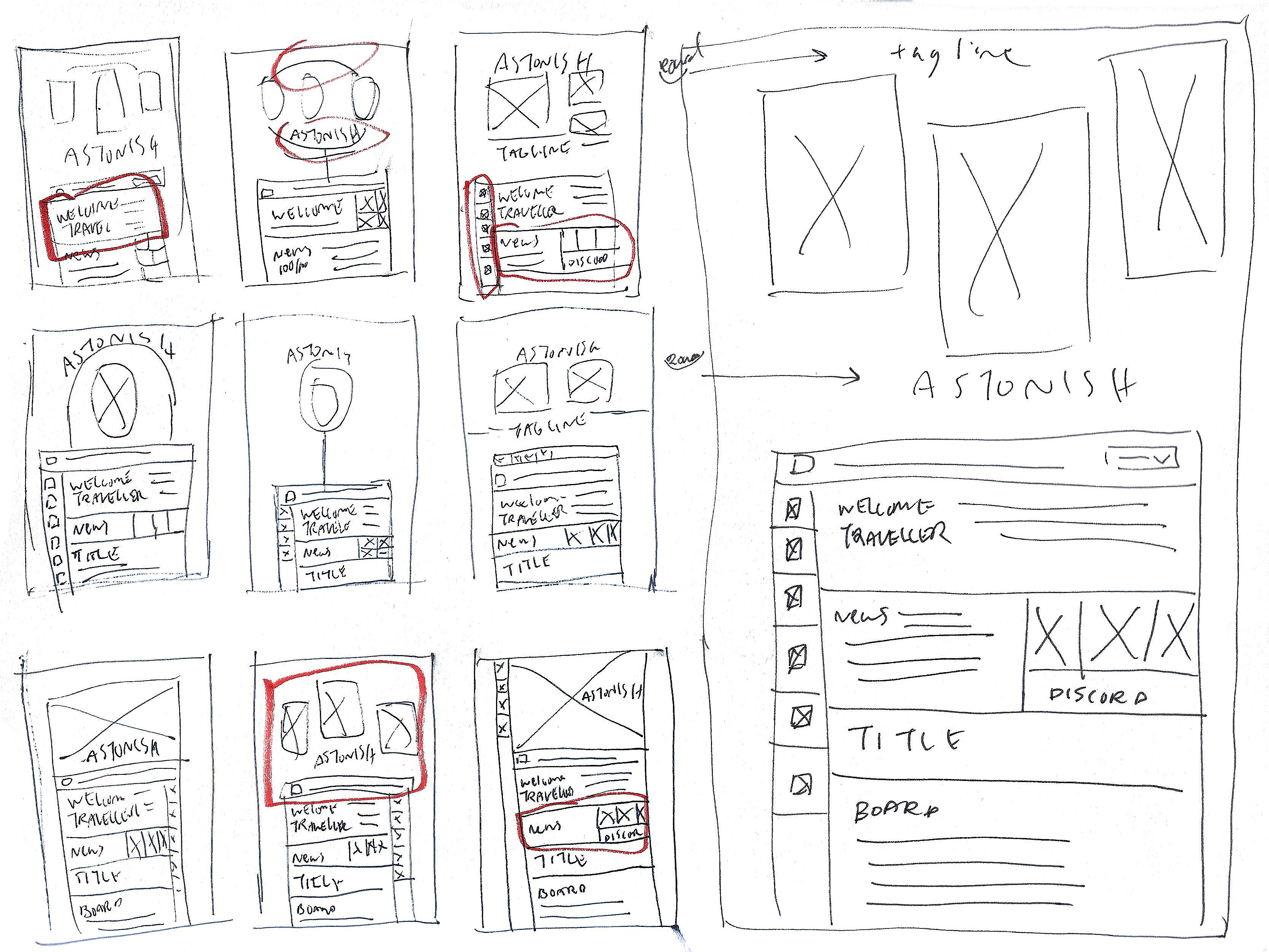
Initial thumbnails
Initial thumbnails of the header for ASTONISH

Then, I looked over each of the thumbnails and marked down aspects that I thought would work well when taken into a more polished wireframe.

An example of this is the idea of a sticky menu bar on the right-hand side, as this was a concept I’d seen a few times when conducting my competitive audit.

Prototyping

With a finalized wireframe for the homepage, I discussed with the client and explained my thought process behind the choices I’d made. I received a positive response from the project manager I was connecting with, and they urged me to begin the prototyping process to bring the home page to life so that they could fully gauge the atmosphere and tone of the design.
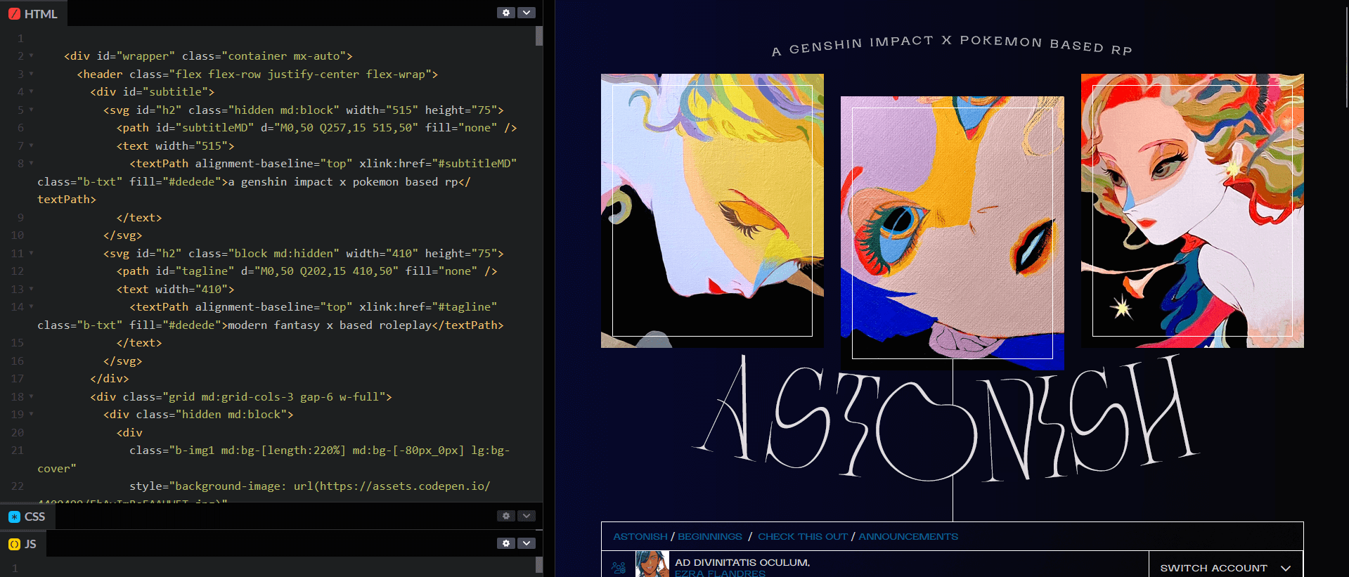
The split coding-preview layout in Codepen
The initial prototyping view for ASTONISH.

This prototyping process was done in Codepen rather than a local environment as it was a small-scale, proof of concept, and the website provided me live updating and easy shareability with the client.

Big Changes

However, partway through the prototyping process, the project manager I’d been reporting to came to me with an issue: the team had made changes to their goals, story, and setting they’d initially decided on.

This meant that the initial design that we’d agreed upon wasn’t going to work going forward, and that I would have to scrap what I had so far and start again.

Sketching II

I did my best to salvage what I could of the situation. Though the project was changing direction, it wasn’t a complete re-write. Fantasy was still the main genre, but the project manager added additional traits such as: minimalism, sci-fi lite, modern, and easy customization.

The last wasn’t something I’d considered in any of my iterations as majority of the website I’d viewed during my research seemed to be static and heavily customized to look a specific way.

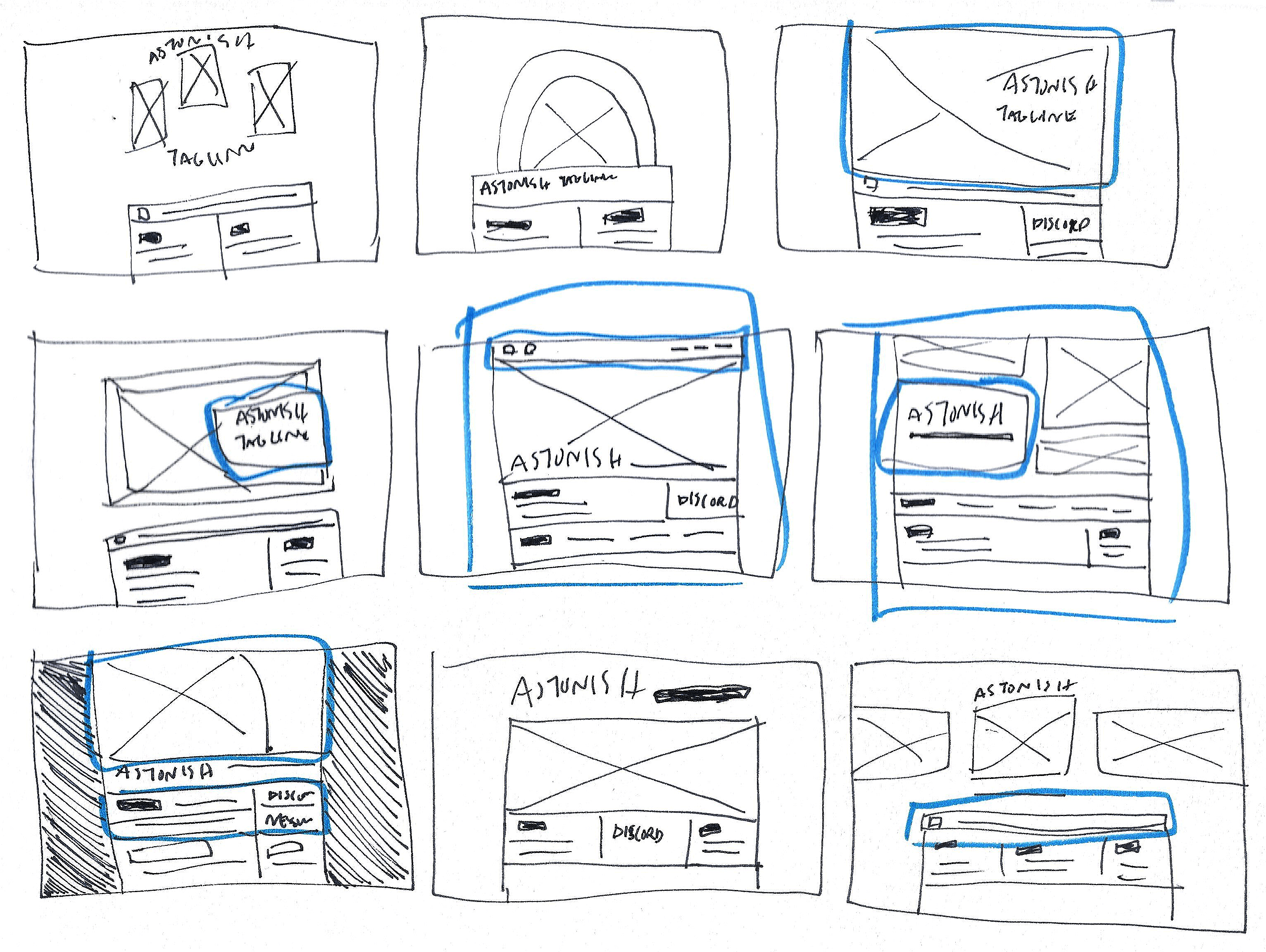
With these traits in mind, I created a series of thumbnails again for the header to start building a new foundation for the rest of the site.

Round two of thumbnailing the header for Astonish
The second round of thumbnailing for ASTONISH.

Wireframes & Mock-ups

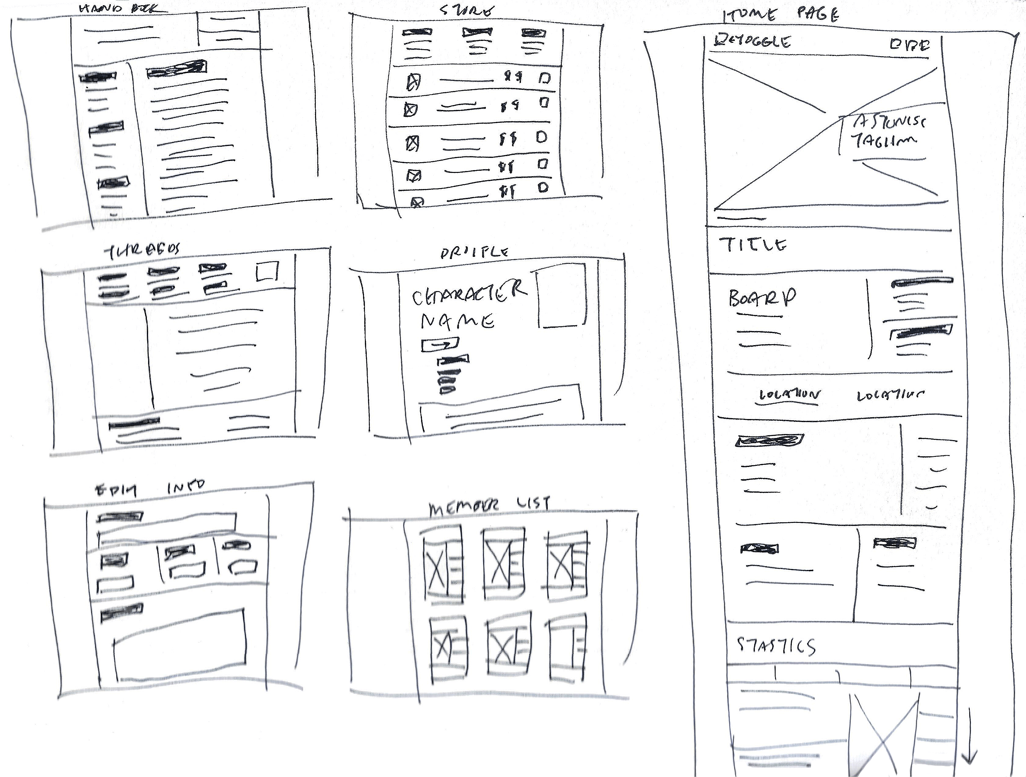
Analog wireframes

With the new traits for the website fresh in my mind, I found the wireframing process to be quite smooth this time around.

Multi-screen wireframe sketches for Astonish
Multiple analog screen sketches for this iteration of ASTONISH.

To ensure that the client would want to move forward with this design fully, I create a larger set of screens to pitch to them, including an expanded home page view, the store page, anh the information handbook among them.

Digital mock-ups

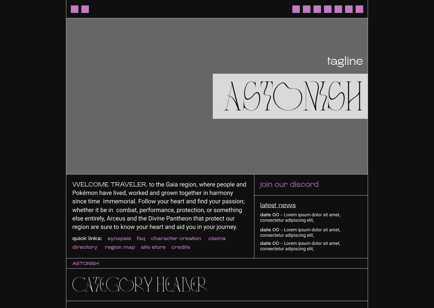
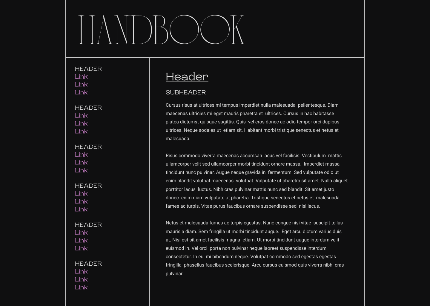
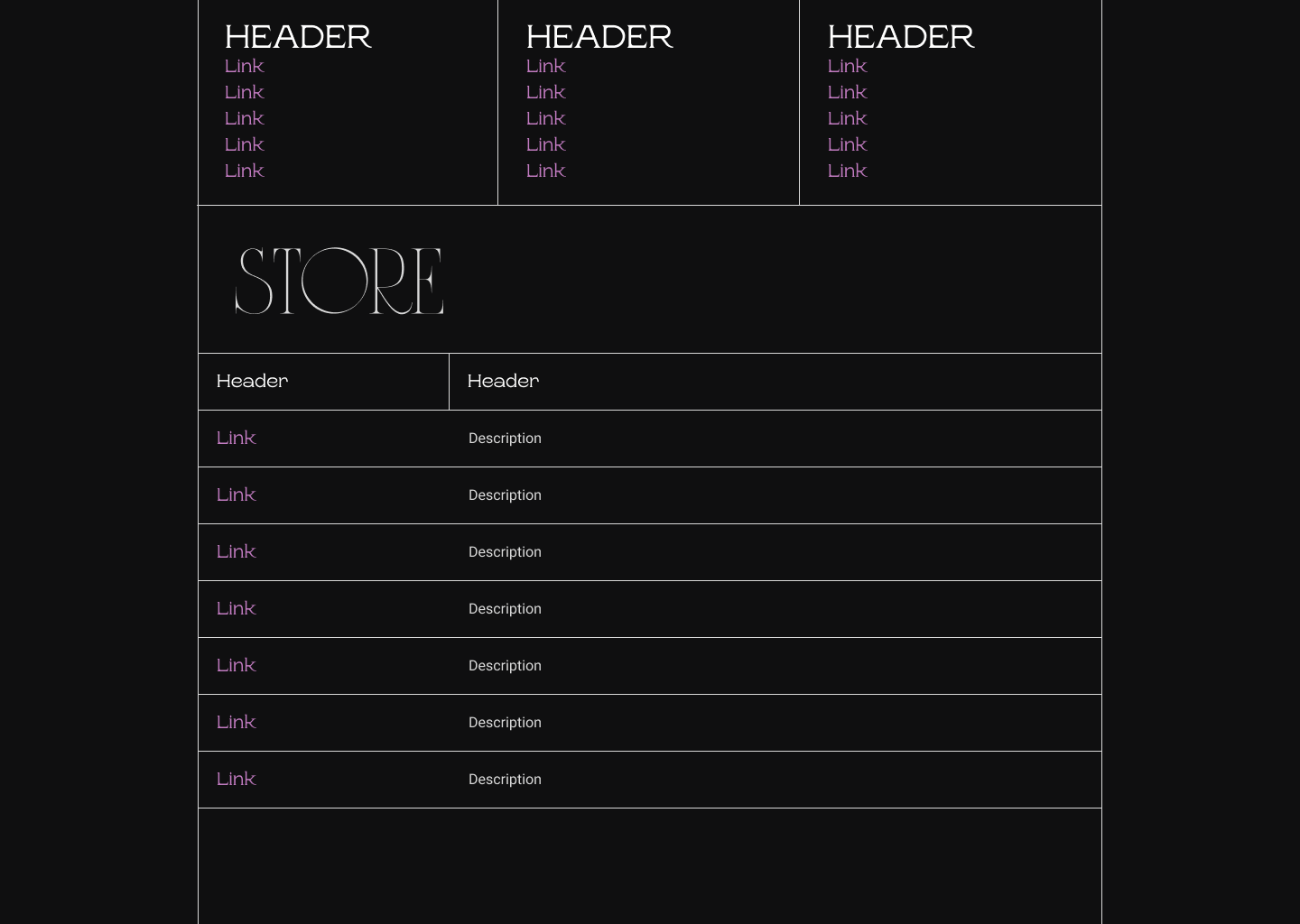
These designs went over well, so I moved into the digitization of the wireframes to provide a clearer picture of the designs in colour.

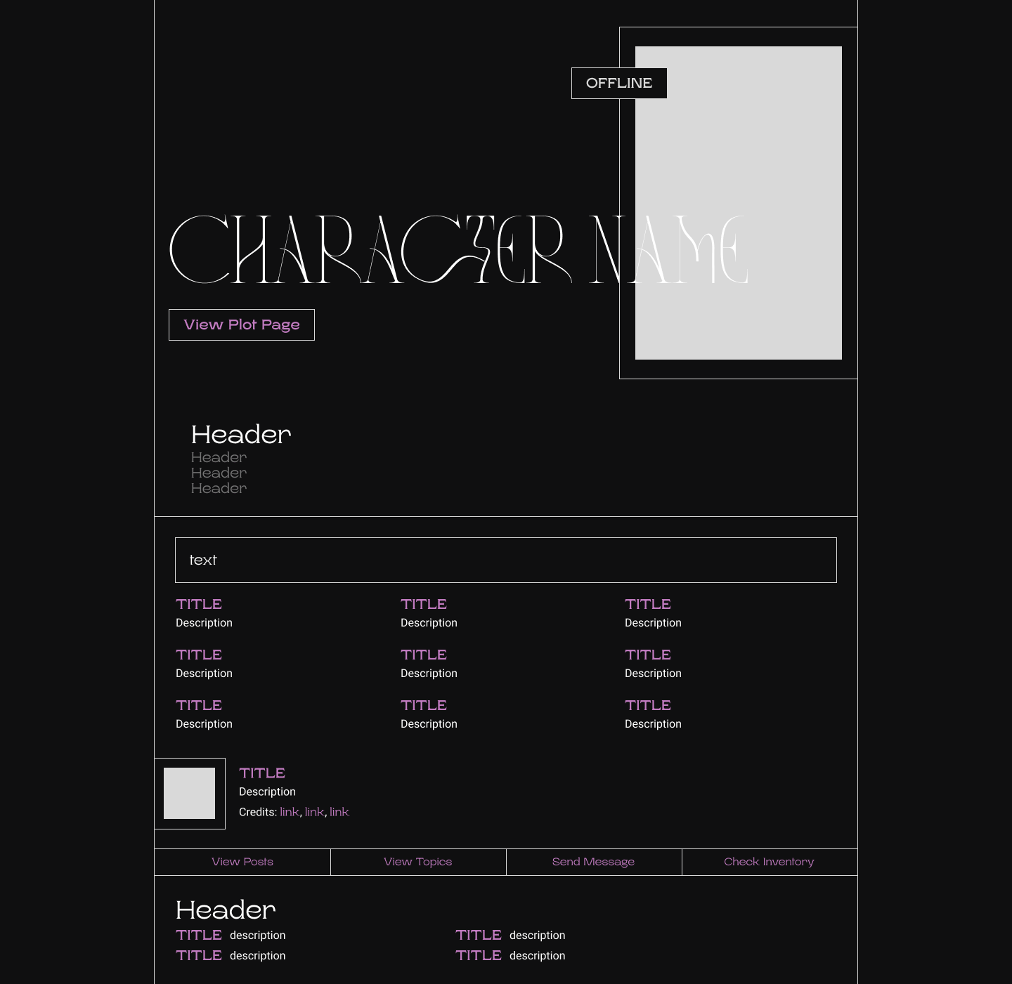
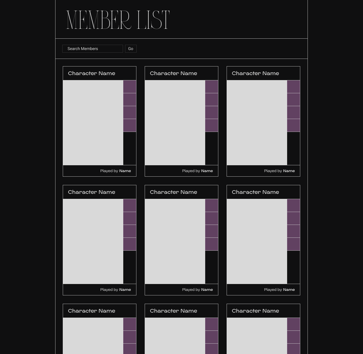
Desktop header mock-up Desktop handbook mock-up Desktop threads mock-up Desktop store mock-up Desktop profile mock-up Desktop member list mock-up
Mock-ups for ASTONISH's desktop layout, done in Figma.

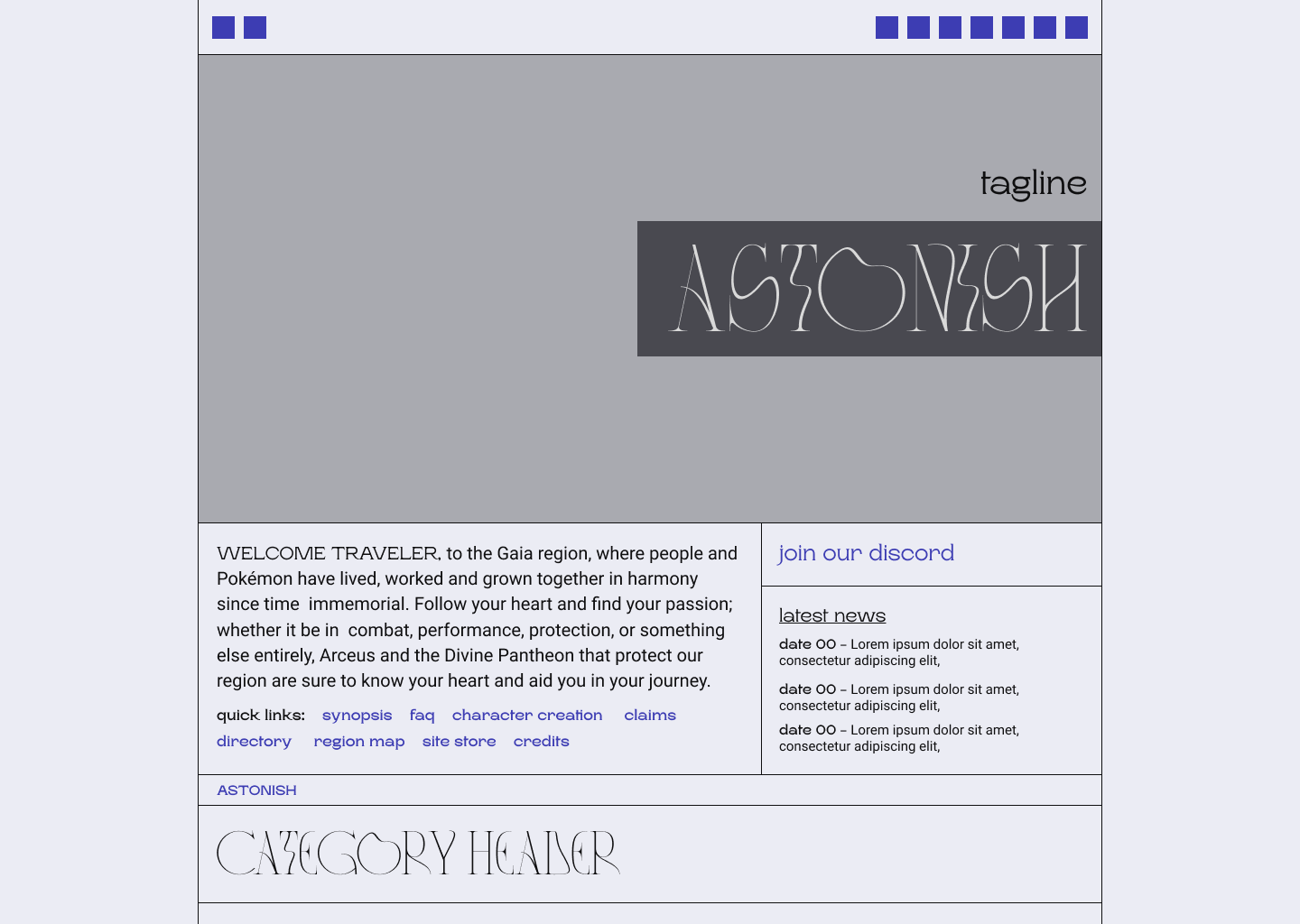
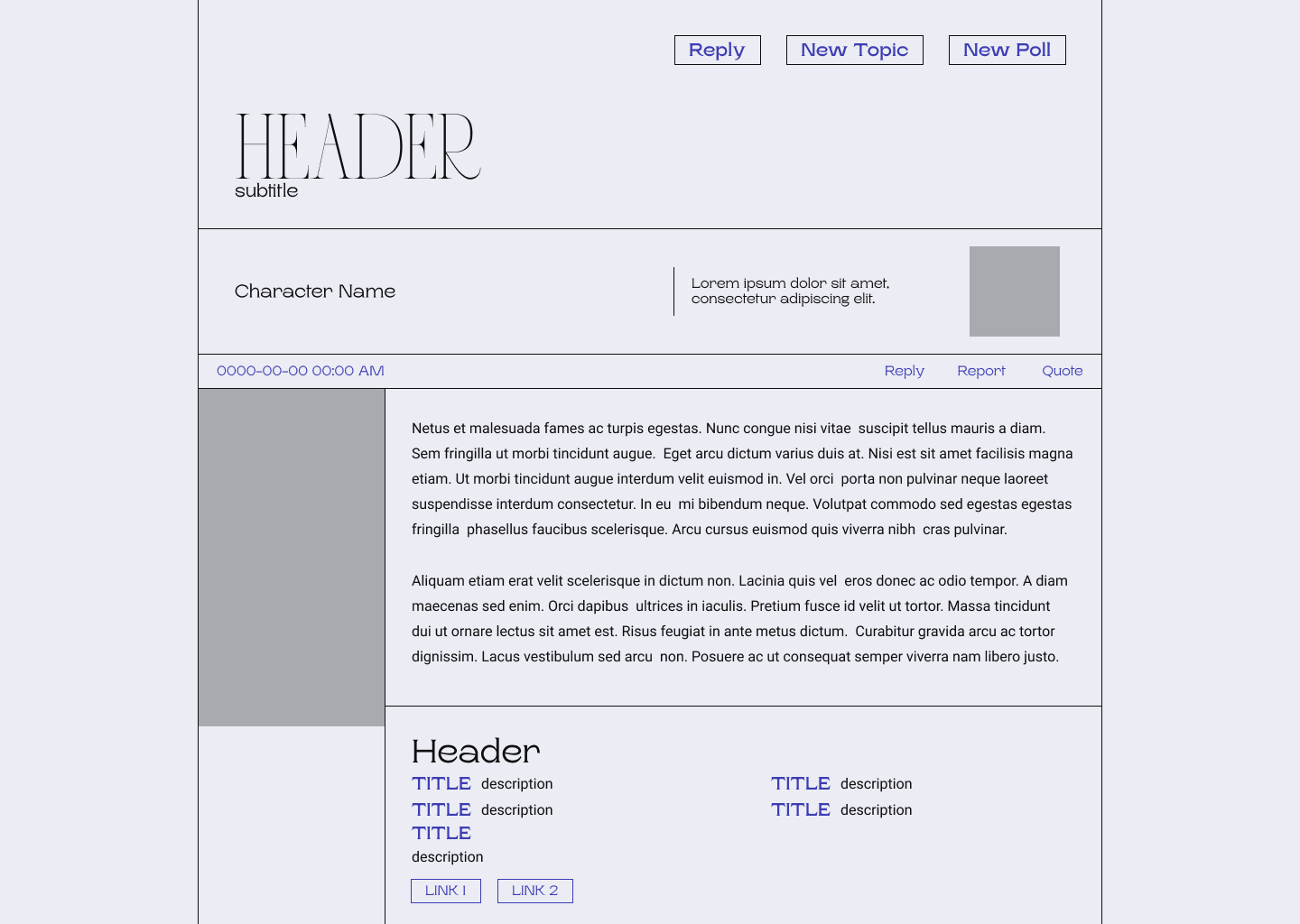
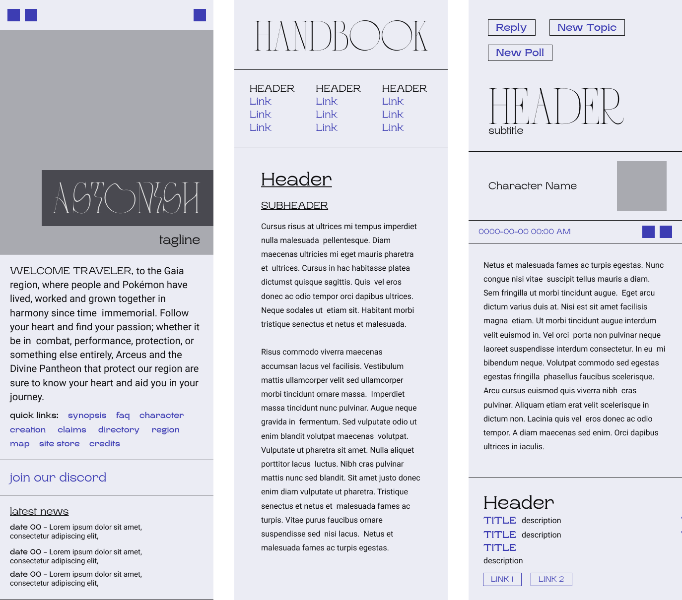
Along with the dark theme for these designs, I also built out a couple of screens for the light theme to show the client what I was imagining for that design.

Desktop light mode header mock-up Desktop light mode threads mock-up
Mock-ups for ASTONISH's light mode.

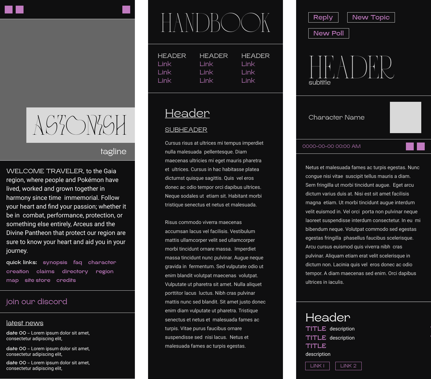
I also expanded upon my designs to build a few mobile screens as proofs of concept for the client, as mobile development wasn't the main focus at this point. For these designs, I did them in both the light colour scheme, and the dark one.

Desktop light mode threads mock-up Desktop light mode header mock-up
Mock-ups for some screens of ASTONISH's mobile view in dark and light themes.

Production & User Testing

With the website’s design laid out in a high-fidelity mock-up and the client’s stamp of approval, I began production on the design itself.

For this project, I used Sass – a CSS preprocessor – and TailwindCSS – a utility-first CSS framework – to aid my building process.

I chose to use TailwindCSS over other CSS frameworks because of the post-processing that will only generate the classes you use, meaning that the file sizes will be true-to-size and avoid bloat like other frameworks.

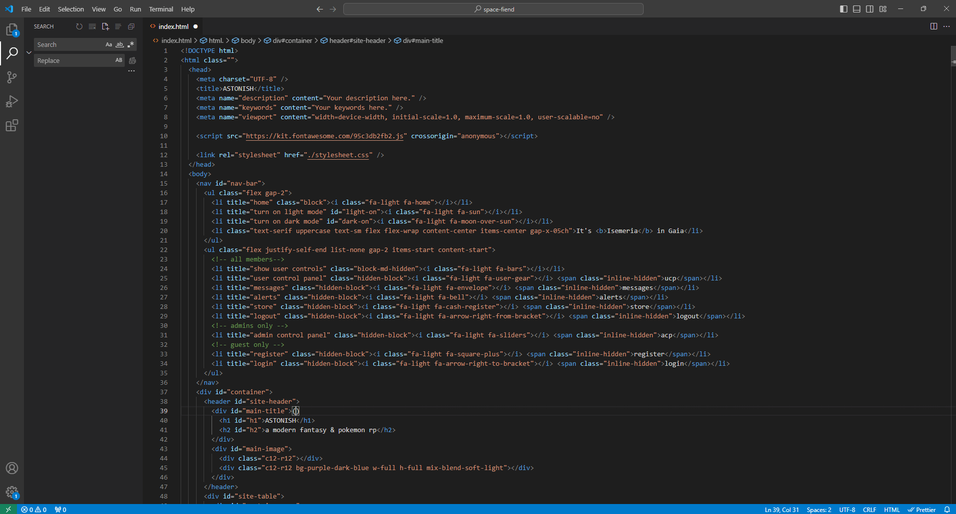
Screenshot of Visual Studio Code and Astonish's code
A screenshot of the code behind ASTONISH's design.

Once production was finished, it was decided that the website would go live as a closed beta to a select few users to allow them to fully immerse themselves with the site at their own pace and give them time to provide feedback prior to the full launch of the website.

Some feedback I received during this live testing phase were comments such as:

  • Making the banner link back to the home page when clicked
  • Adding a name display in the header to help users keep track of the account they were on
  • Adding a display for the current season in the navigation bar, for easy viewing.

As reading and writing were main aspects of this site, I also discussed with the client and was able to reach out to a few dyslexic writers who looked over the site to ensure that the fonts and their sizes wouldn’t negatively impact their creative experience.

Conclusion

By the end of my time with ASTONISH, I found myself satisfied with what I’d created, even if the process of its creation wasn’t nearly as smooth as I’d wanted it to be.

Overall, I was reminded of the importance of properly documenting and providing more in-between steps for those that I work with to help ensure that the designs are taking on a viable shape in the eyes of all the parties involved. This is something I’m going to keep at the forefront of my mind for all projects going forward.

ASTONISH’s design really pushed my limits as a designer – and to some degree, as a coder – and as a result, I feel much more comfortable when it comes to designing for seamlessness across devices and working in Figma as well.