ROLE: Lead Designer
DURATION: November 2023 - January 2024 (2.5 Months)
legsilate.me aims to tackle three main challenges:
- Centralize information and updates on local and federal government bills
- Help users streamline research into bills
- Offer explanations to help users understand proposed and passed government bills
Examining competition
In the domain of government bills and text, there are some companies and apps that exist to help their audiences better understand ongoing, or recently passed, bills. However, the ones specialized in this realm are often paid and business-orientated, meaning they aren't advertised or accessible to the average individual.
Often, they offer services that include AI generated summaries mixed with advice from legal professionals, and specifically aim to help businesses take preventative action when it comes to new bills.
On the other hand, while there are many free-to-use summarization tools online, and even AI-backed ones such as ChatGPT, they are often plagued with character limits, or require users to copy and paste text directly into their text boxes to start the summarization process.
| Company | Summarization | Built-in Dictionary | Free to Use | Quick Sharing | Sort by Location | Canada-focused | Displays Related News | Bill Tracking |
|---|---|---|---|---|---|---|---|---|
| Open Parliament | Yes | No | Yes | No | Yes | No | No | No |
| Fiscal Note | Yes | Yes | No | No | No | No | Yes | No |
| Plural | Yes | No | Limited | Yes | No | No | Paid Option | Yes |
| leg.bc.ca | No | No | Yes | Yes | Yes | Yes | No | No |
| parl.ca | Limited | No | Yes | Yes | No | Yes | No | No |
Preliminary Interviews
I conducted interviews with five young adults, ranging from early 20s to 30, all with varying levels of political activity, and legal knowledge and familiarity. I functioned as both a moderator and note-taker over the full duration of all the interviews conducted.
STANDOUT OBSERVATION
- Majority of users preferred to do their own research, and see as many sides and perspectives as possible before coming to their own conclusion.
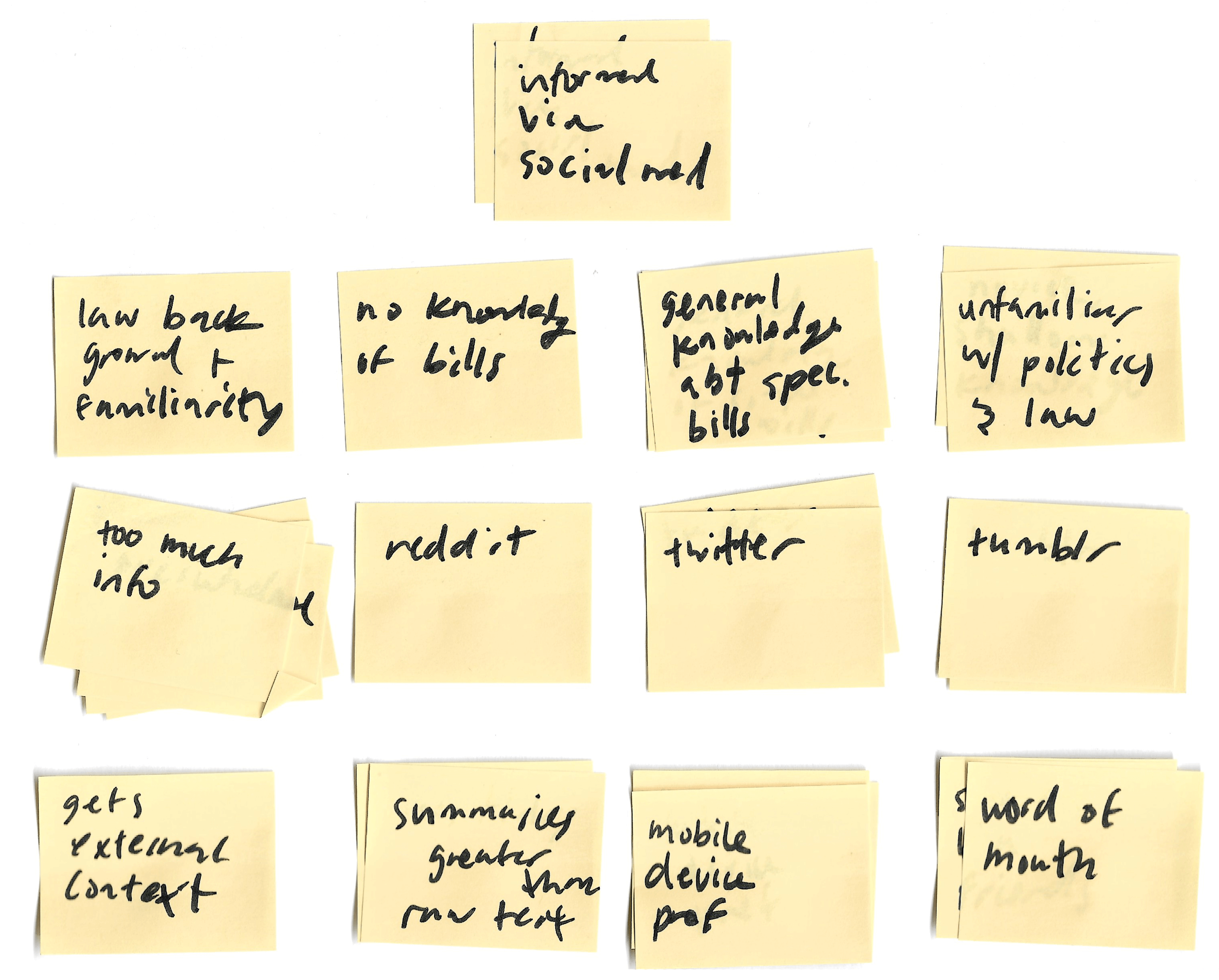
Other notable discoveries that were made over the course of my interviews included:
- Social media and word-of-mouth played a large role in information gathering and research
- Users sometimes neglected research when resources were very scattered
- Political and legal language makes reading bills and laws intimidating
- Many preferred to read text on mobile devices, often in bed
Modeling
With these insights in mind, I was able to put together a clearer picture of what legislate.me's primary might look like. This being, someone who wants to know more, but doesn't where to start when it comes to bills and the process behind passing them.
User Persona

Virgil Lionel
- Age: 24
- Education: University Graduate
- Hometown Toronto, ON
- Family: Mom, dad; Large extended family
- Occupation: Social Media Manager
Goals
- Share bills with friends and family easily and quickly
- Stay informed on local & federal bills
Frustrations
- Family members aren't tech-savvy
- Doesn't have time to constantly do his own research on recent events and bills
USER STORY: As a 24 year old, social media manager, I want to stay on top of government bills and be able to share information with others easily.
Defining app requirements
A big factor in the creation of this project was scope and size, which were both kept small as this was meant to be a single person project. I had to be specific when it came to the app requirements, and this required me to keep the functionality to a bare minimum.
For me, based off the interviews I did, functionality revolved around these factors:
- Bill summaries are easy to read.
- Pages and information should be easily shareable.
- Users should be provided resources to exapand their knowledge, if they so choose.
Information Architecture
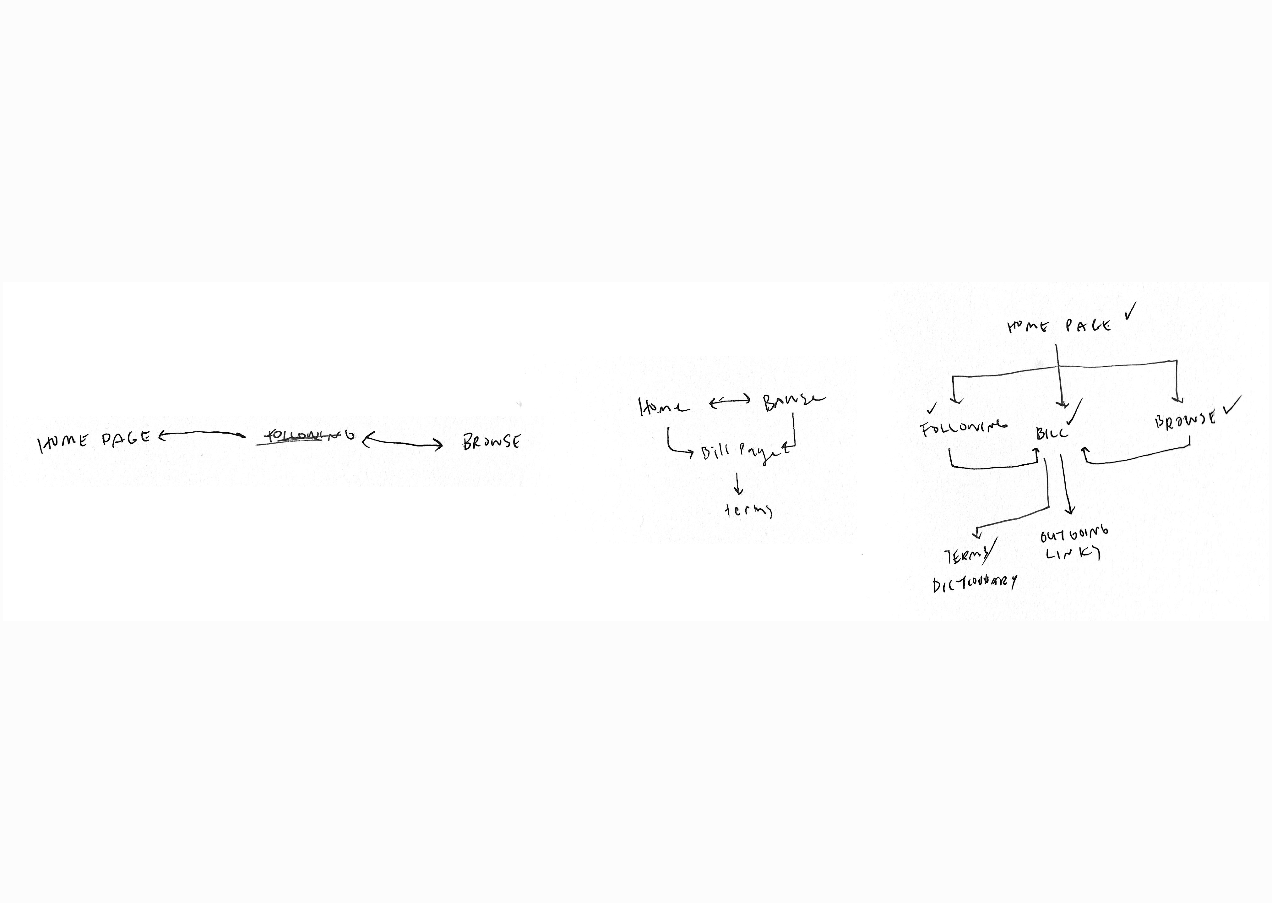
Before the wireframing process and with the app requirements in mind, I planned the information architecture to help lay out the user flow and manage the number of screens I was planning to create.
Wireframing
With the architecture laid out, it became easier to visualise the user's journey, and helped kickstart the iteration process for the screen designs.
For each screen, I aimed to roughly create 6 to 8 different iterations of each screen.
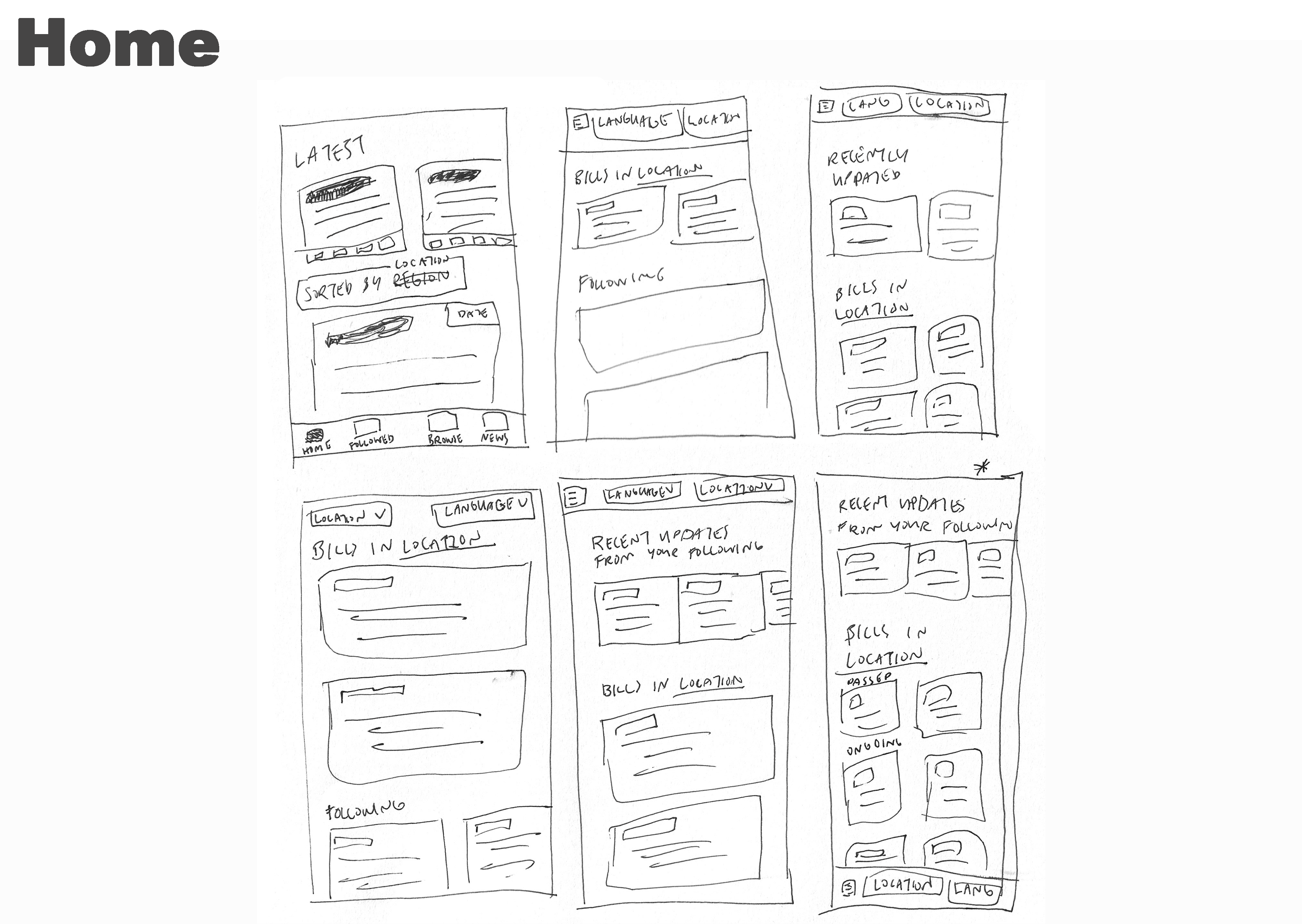
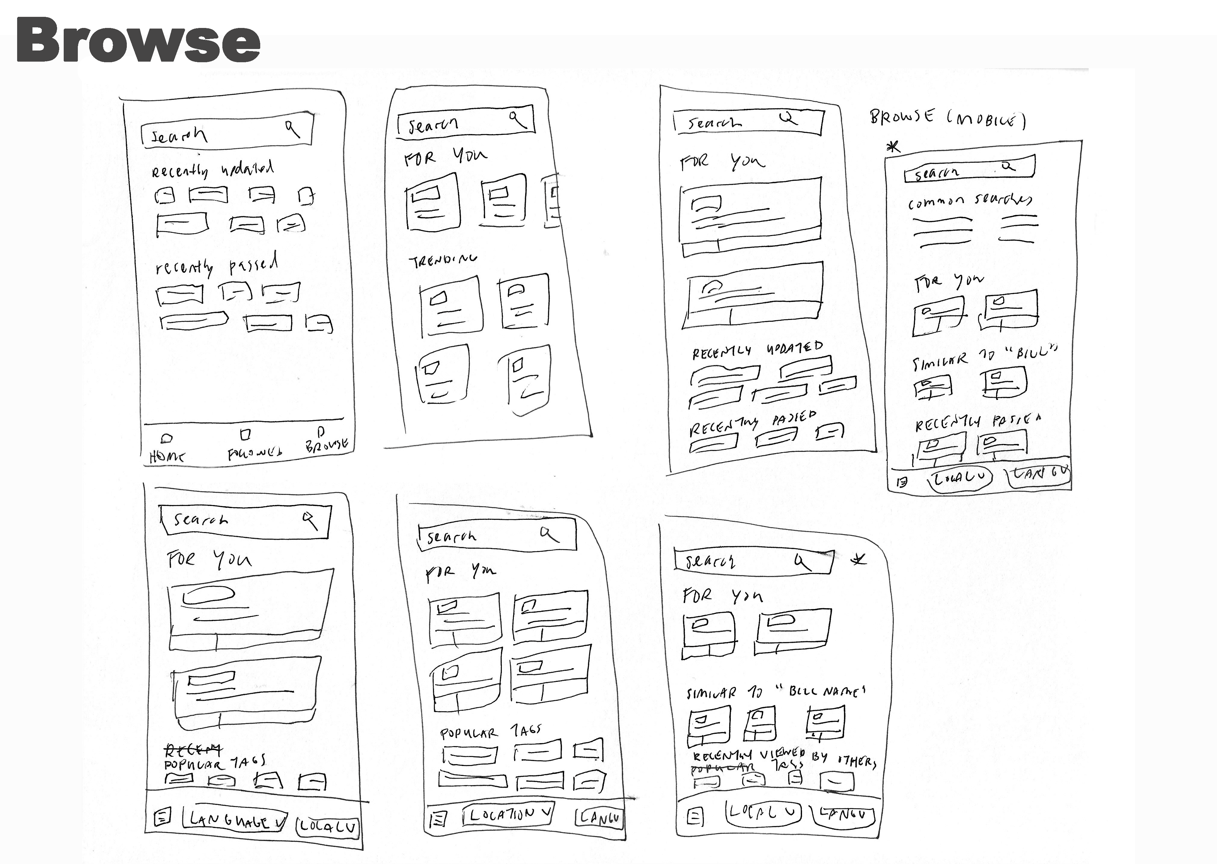
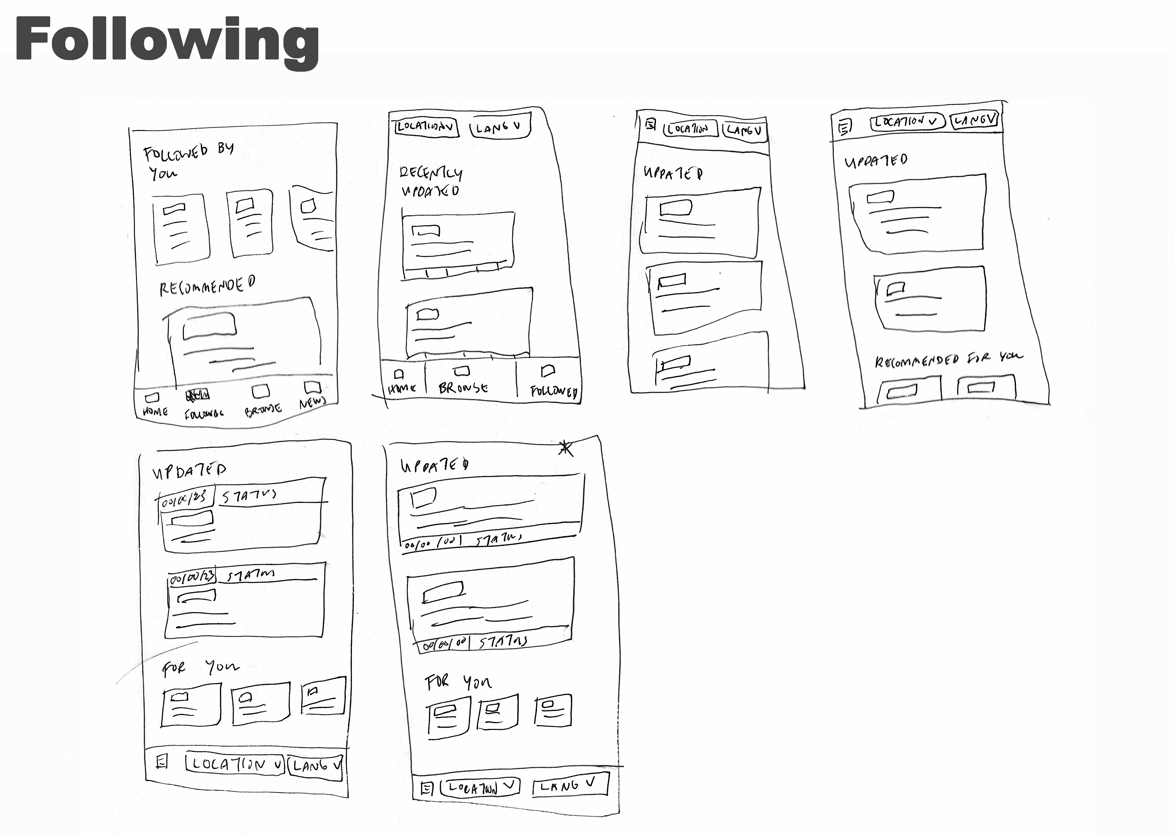
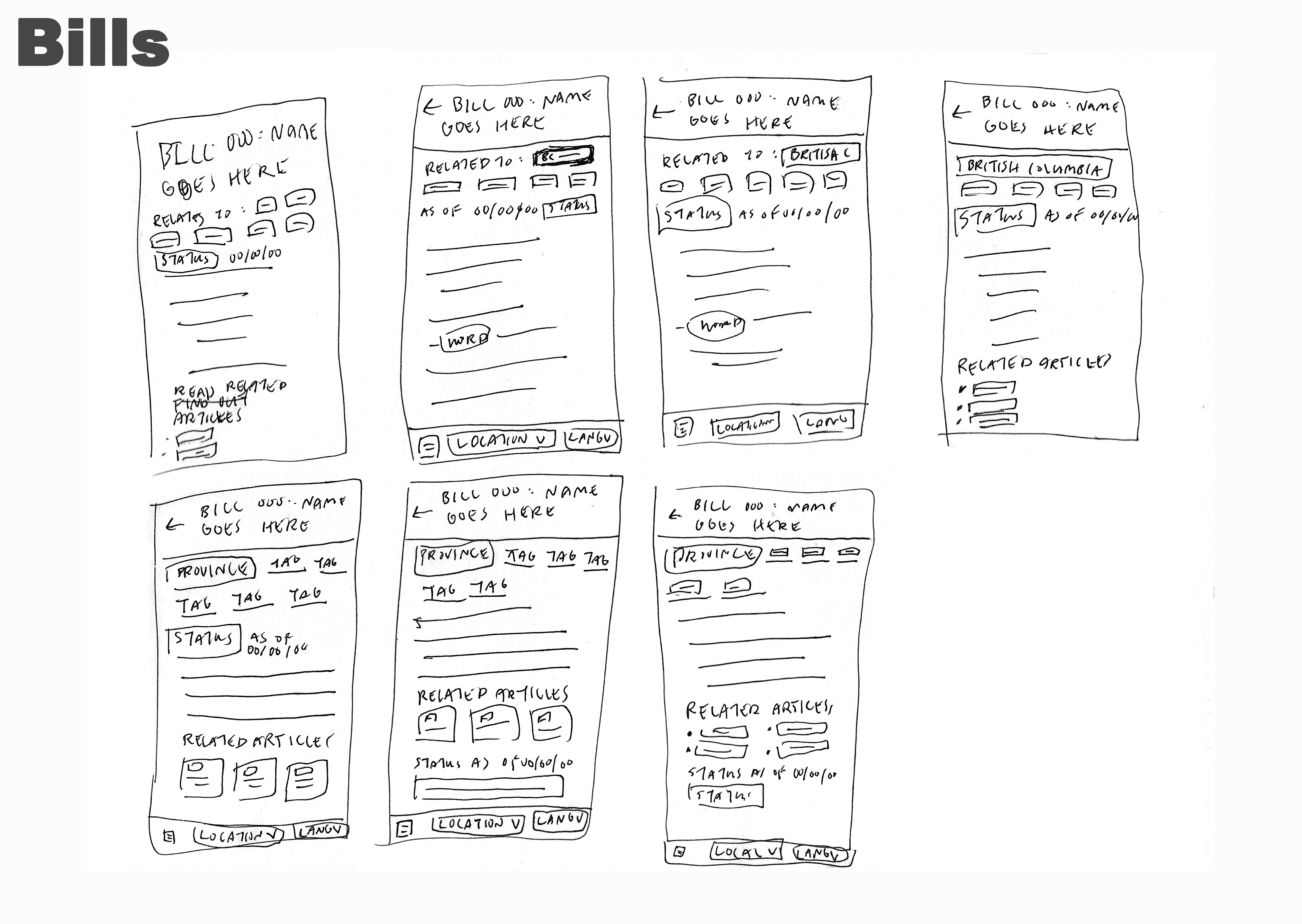
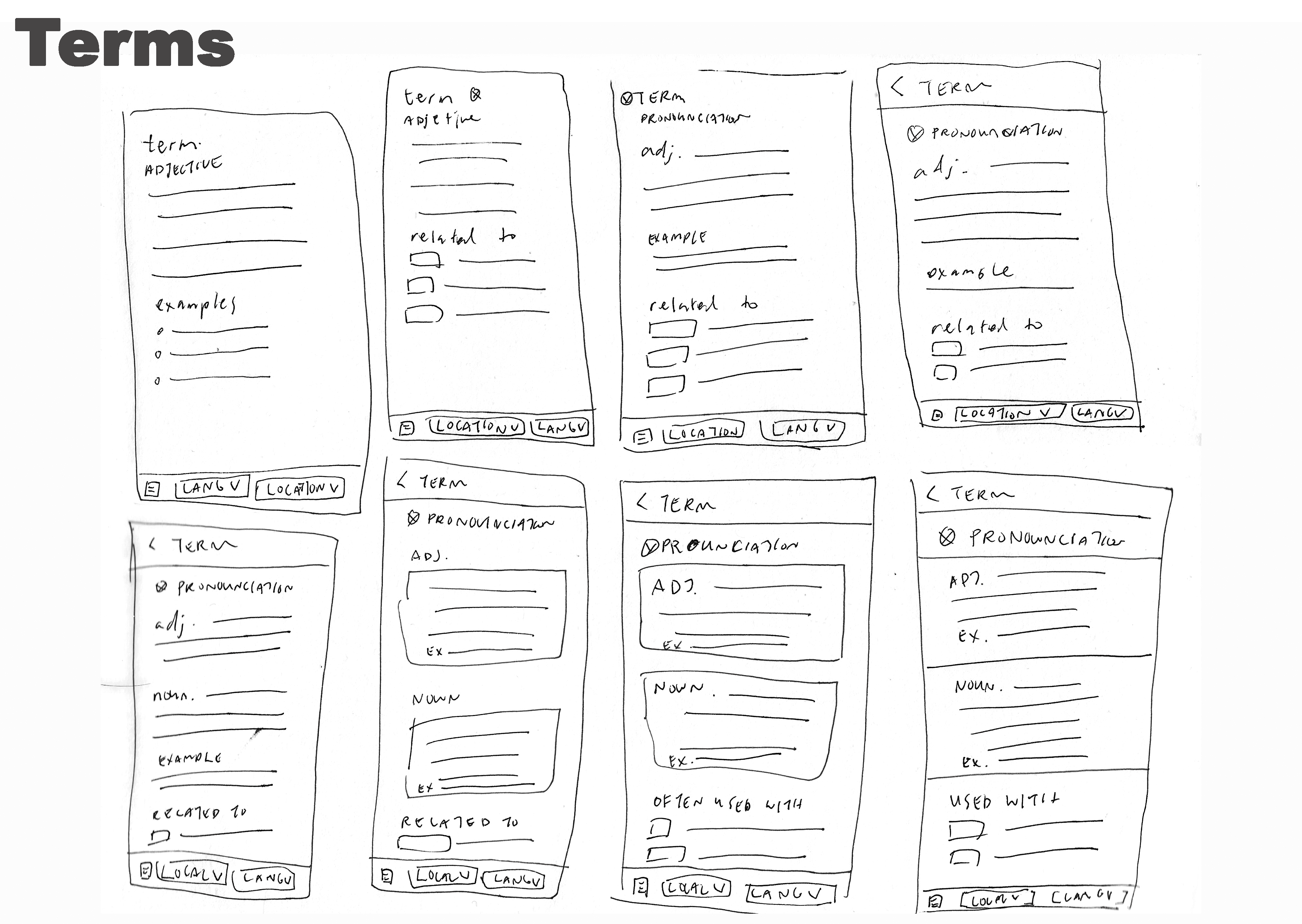
Once I finished with the iteration process, I went back to pick parts of the wireframes that I liked to synthesize into a final design.
Aspects such as a list layout for common searches on the browse page and for related texts on the terms / dictionary page, and subheaders for the bills on the home page were ones that I believed would help simplify and add clarity to a user's journey through the app.
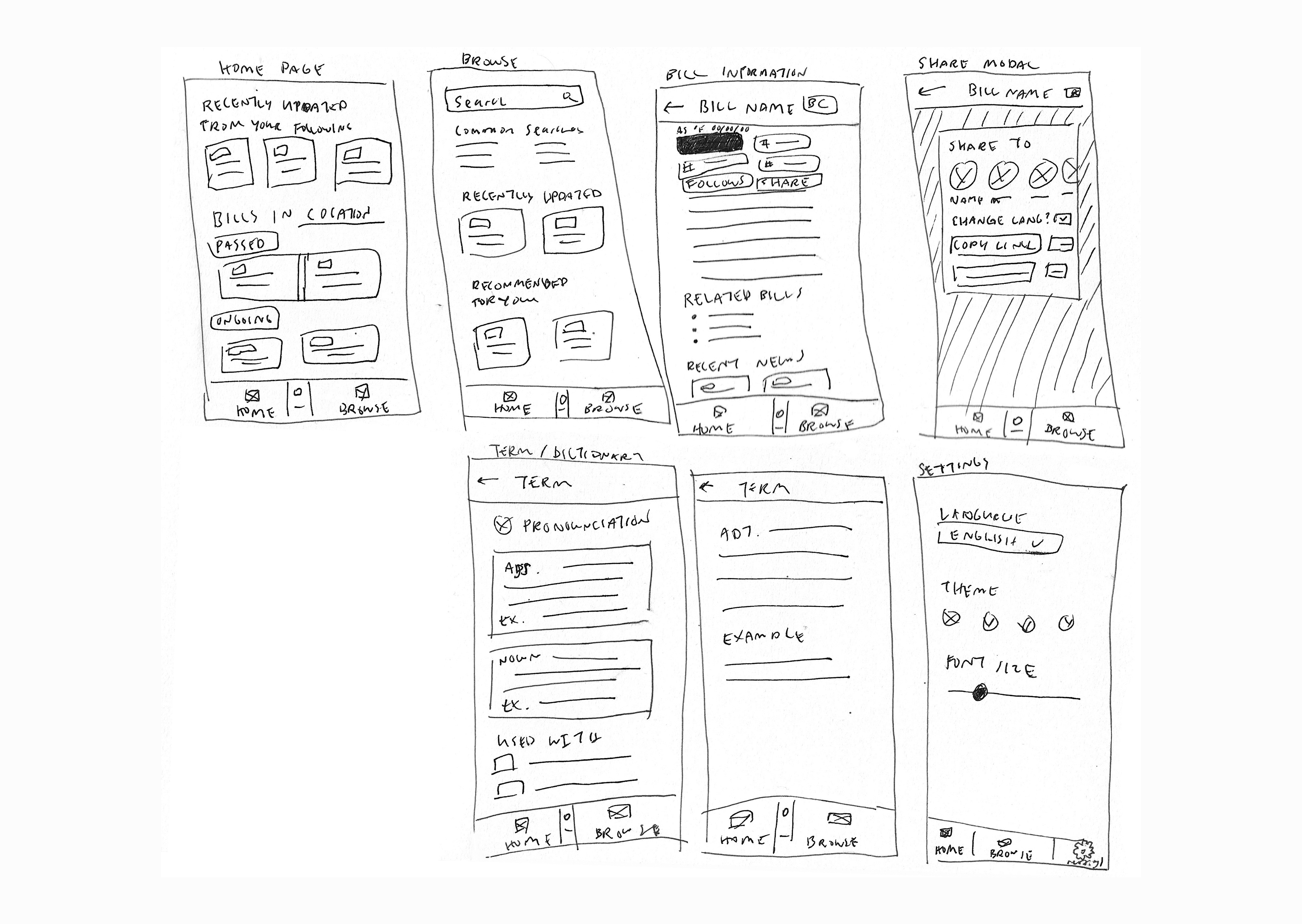
With the screens finalized, I took them into Figma to see how they would look in a digital space, and to gain more experience with the software.
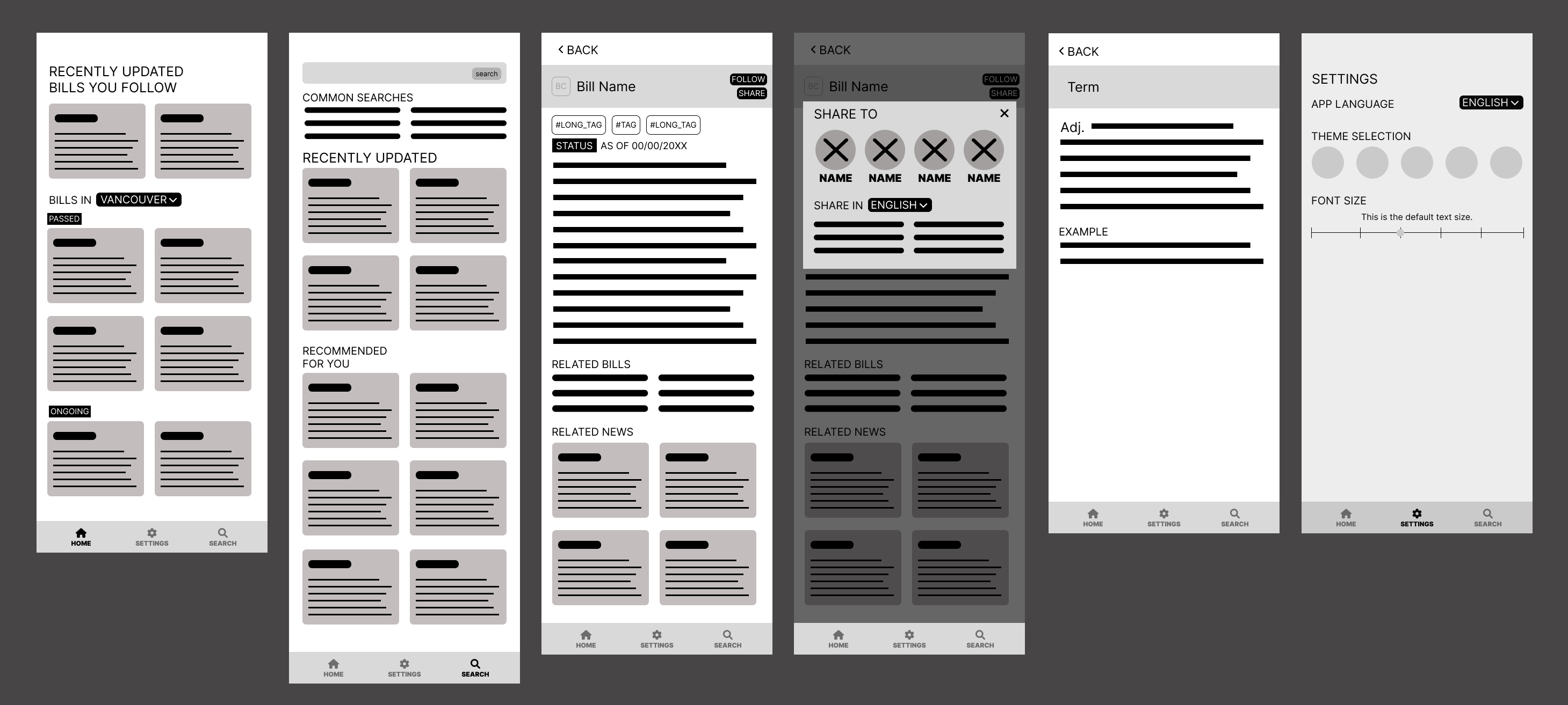
As well, while in the wireframing stage, I thought it would be useful to provide a separate page solely for bills that users chose to follow. However, upon further consideration, I decided to leave out this page and instead add a spot for followed bills on the home page to simpify the number of clicks needed in a user's journey, and to simplify the app's layout.
Testing
With the design wireframed in Figma, I decided I wanted to refine it more and add in actual text and content to give myself the ability to continue practicing with Figma, and to gain more experience by conducting a set of usability studies with a prototype.
During this process, the design went from a light-based design to a dark-based design. This choice was made after consideration was taken into the default setting of dark mode on many popular, mobile apps, such as messaging or social media apps, and after reviewing feedback from my initial interviews, where those interviewed expressed preference for dark designs when it comes to reading content on their mobile devices.
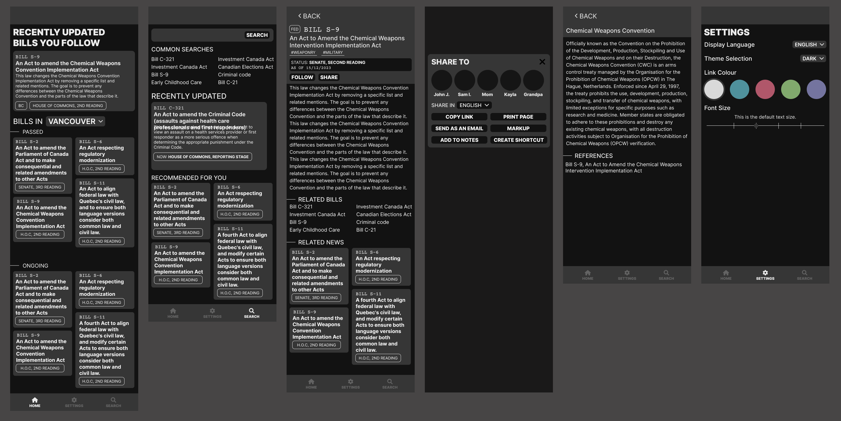
With the prototype completed, I conducted a set of three usability studies to gauge user flows, interactions, and thoughts. Over the course of these usability studies, the interviewees had similar comments around legislate.me's design.
Refinement
The comments boiled down to three main factors.
1. Lack of indicators on text vs. links made it hard to differentiate

To address this issue, I gave all interactable items [such as links, or buttons] a colour separate from the text colour. As well, I made sure to adjust the font weight for plain text links to add more difference, when contrasted against regular text.
2. The app felt cramped, with too much small text, in too little space
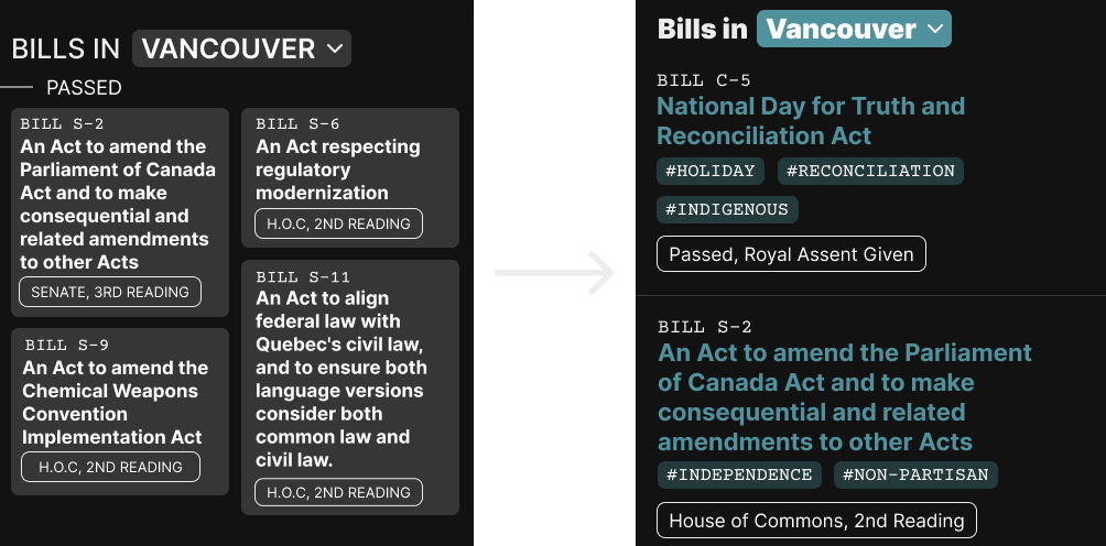
For this issue, I removed the gray containers that I put the bills in, and removed the column layout throughout the app.
By removing the containers, I was able to have more space to double the padding and margins for each section. With the removal of the column layout, bills were no longer squished together, and overall, the text and content of each bill was given more room to breathe in order to increase readability.
3. More descriptors for bills would be appreciated for understanding

For this final issue, rather than display a shorter summary of the bills, I opted to move the tags to the browse and home page so that users would be able to better understand common themes and ideas involved with the bill.
By removing these short summaries, this also help to lessen tightness and crowded nature of the text on the app.
Style Guide
With these changes made, I decided to give myself practice in the creation of a style guide by going back and gathering all the materials I used to create this version of legislate.me.
- Inter was chosen as the main font because for simplicity, familiarity and readability
- Courier Prime as the subtitle font for contrast
Primary Colours
Alternate Accents
- Colours were chosen as muted and subtle alternatives to the colours offered on the official website of the Parliament of Canada website.
- Less vibrant, but brighter shades were chosen to foster a calm and relaxed tone throughout the app.
- Blue was the chosen as the main colour as blue is the main colour used on the Parliament of Canada website.


Conclusion
Though I believe I reached a satisfactory end design for this form of legislate.me, I know that this project has the potential to be expanded further and at some point, I plan to expand it with a desktop design as well.
Overall, I learned a great deal about the UX research process. In specific, I gained valuable experience when it comes to being a moderator and gained a new perspective on how to craft better interview questions.
In terms of the design process, I did a lot of research and gained a lot of knowledge when it comes to Figma, and how to better adapt user feedback into executable and tangible changes to better their journeys with my designs.
